10 Ecommerce A/B Testing Ideas for Your Homepage (With Examples)
Even if you’ve been running tests for a while and you’re looking for an inspiration boost or you’re just starting your optimization journey and you’d use some tips to get you up and running, these ten ecommerce A/B testing ideas might help out.
If done right, A/B testing could really help your company make more money. It’s a great way of figuring out what exactly works on your website and what doesn’t.
Since this is a data-driven process and numbers don’t lie, you can be 100% confident that once you implement the winning experiments as the new control, they are bound to bring you a significant uplift in revenue.
1. Test 3-5 benefits icons under the ATF area
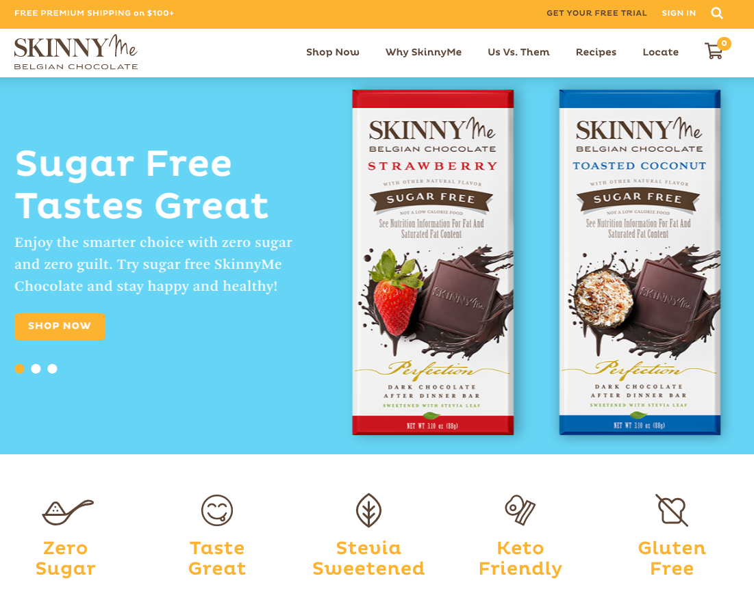
By highlighting the benefits in a visual manner you make sure that visitors will spot them immediately, generating a potentially high impact on their purchase decision. Pairing up written content with visuals is the best way to prime your users and to subtly prepare them for ultimately buying the product.
2. Test a video vs. a static image on the Hero Section
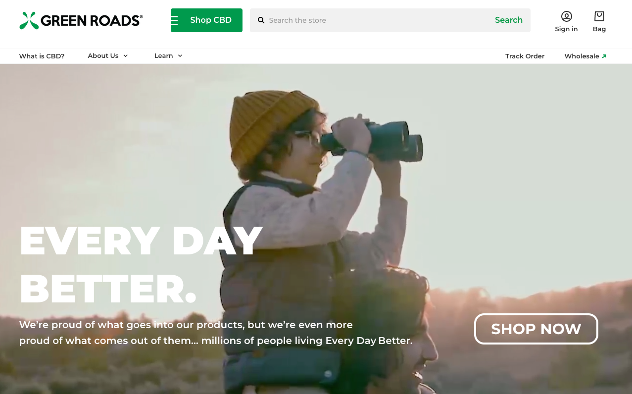
They say a picture’s worth a thousand words – so it’s safe to assume that a video can drive even more engagement and conversions than a photo. It’s one of the most popular ecommerce A/B testing ideas out there and it’s definitely worth trying out. However, you need to make sure that you mute the audio and remove visual controls. The video also needs to add value, otherwise it might backfire and hurt conversions.
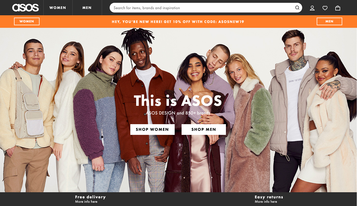
3. Immediately segment your visitors into women and men by featuring two CTAs
This applies especially to large apparel stores that sell both women and men clothing. The styles are different, the audiences are different, so why not address them separately right from the start? You’ll essentially create two different conversion funnels which will enable you to offer each segment a relevant shopping experience. This will potentially have a positive impact on the store’s overall conversion rate.
4. Include client testimonials higher up on the homepage
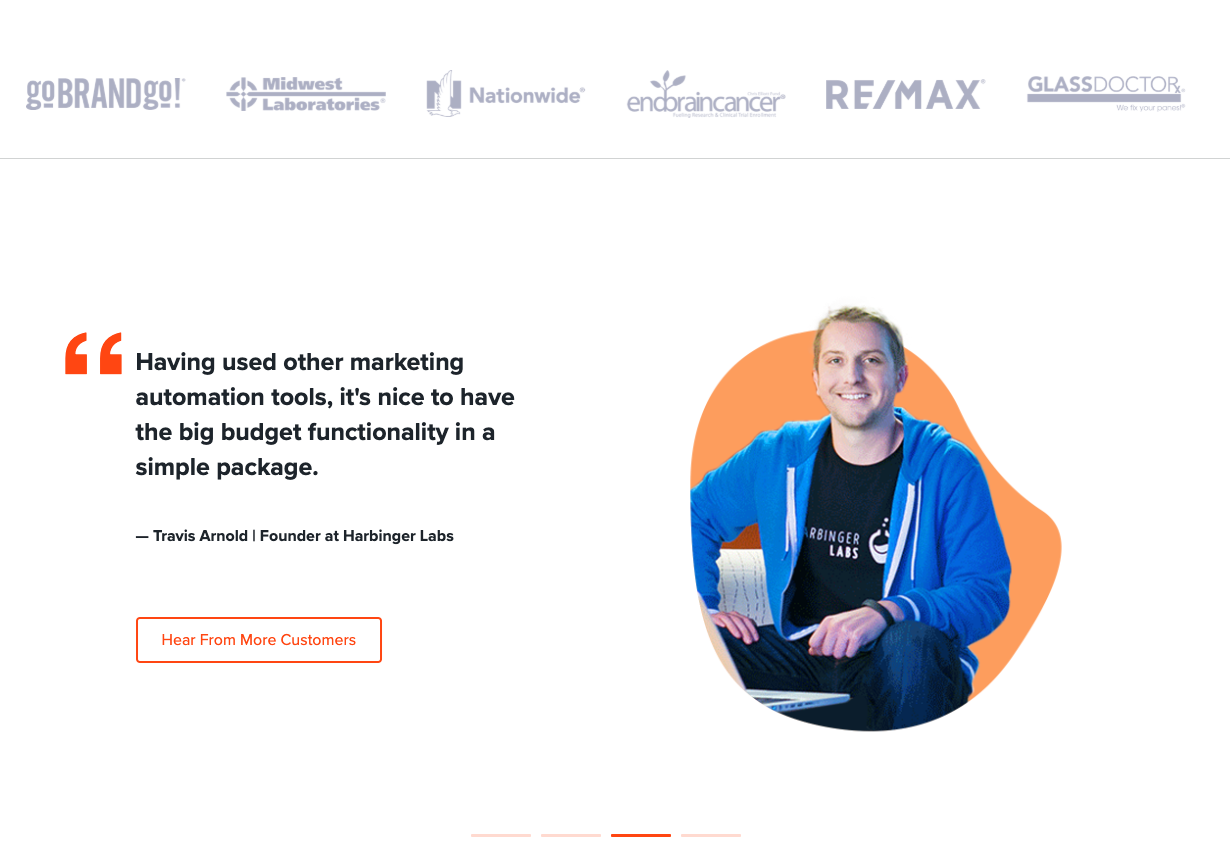
Including client testimonials on your website it’s a must-have and one of the most important CRO best practices. However, they are usually placed towards the end of the page, close to the footer – which is more often than not only seen by a small percentage of visitors. Because testimonials are such a powerful form of social proof, building customer trust and boosting brand credibility, you could test placing the section higher up on the page. Even if it’s not an ecommerce website I’m still going to point out what Hatchbuck did in this case. They featured the reviews under the ATF area for maximum visibility.
5. Test a pop-up for new visitors featuring a discount in exchange for contact information
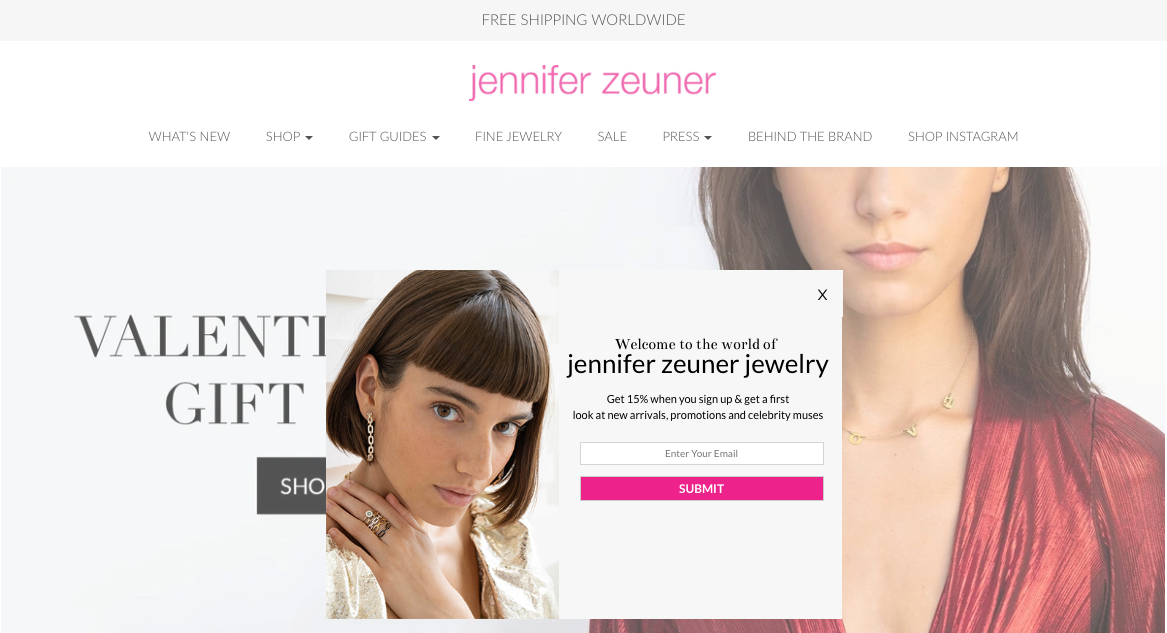
Enriching your email database means that you’ll be able to target more visitors with drip campaigns, newsletters and cart abandonment emails. Email marketing is great for increasing the number of recurring customers and thus, your shop’s revenue. It’s also been shown to be an extremely effective marketing strategy because it drives a massive percentage of total transactions.
6. Test adding a media bar under the Hero Section
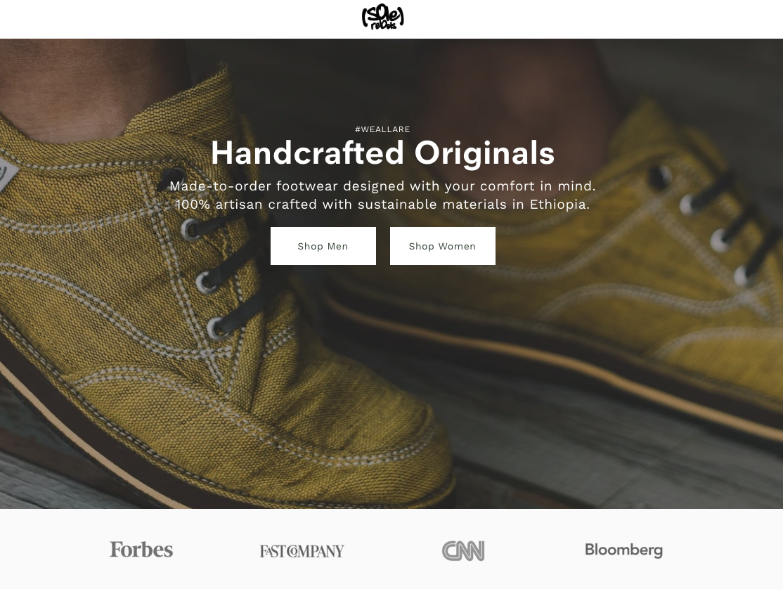
Featuring logos of prestigious publications, magazines or tv channels which at some point did a story on your brand or praised your product in any way it’s an incredible boost for your brand credibility. The influence and authority of these media giants will automatically transfer onto your brand, raising the value of your product. Not to mention that people tend to buy goods that have been recommended by an authority figure/influencer rather than products which completely lack this sort of social endorsement.
7. Test featuring a sticky discount banner above your navigation bar
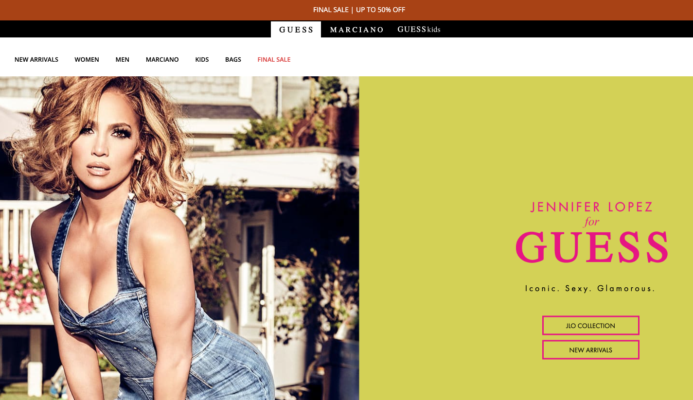
If you’re looking for uplifts in your conversion rates, what better way of achieving this if not by highlighting a sale on the top of your homepage? And if you also throw an urgency element in the mix (such as a countdown timer) you’re looking at potentially significant uplifts.
8. Test a leaner version of your homepage

Nobody likes to see a busy homepage with a lot of elements crowded in all corners. Besides being completely unaesthetic, it’s also a surefire way of driving visitors away. This is why the latest trend in UX design is minimalism. The more white space on your page, the better. Even if it might seem that this trend has been mainly adopted by luxury brands, no one stops you from testing a cleaner, more simple and spacious version of homepage on your own website. The results could be surprising!
9. Test displaying social proof in the form of numbers
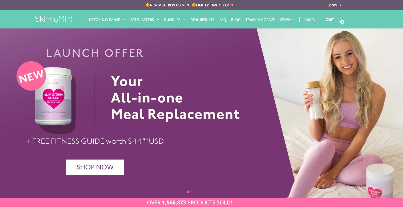
People are more inclined to buy something if they know that ‘x’ other peers have done it before and they were satisfied with the results. This is why social proof in the form of crushing numbers usually works wonders on a shop’s conversion rates. For instance, SkinnyMint used the number of their total sales to showcase the product’s value and desirability. However, you can also go with the number of followers on social media, the number of happy customers etc. Either way, you’re applying one of Cialdini’s principles of persuasion – social proof – which is bound to generate positive results.
10. Test displaying best sellers on your homepage
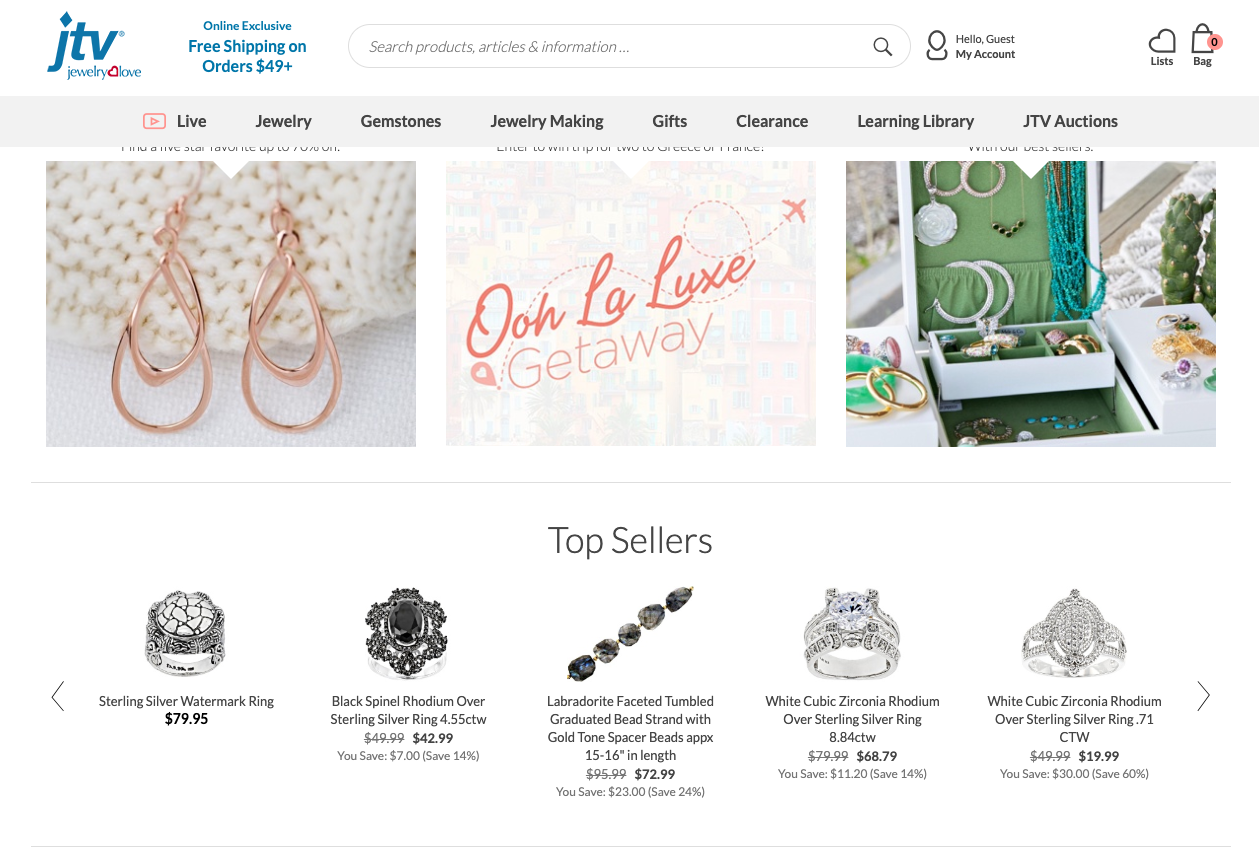
Imagine that you own a brick and mortar clothing store. You’d definitely display your best items in the storefront so that you’d attract people’s attention to your merchendise. If they’re just passing by and they like what they see, they’ll most probably come in and buy something. Well, it’s the same with your website. The purpose of the homepage is to attract, to get people off the homepage and into the store. This is why featuring best sellers on your homepage is something definitely worth testing.
Conclusion
Whether you’re just starting your A/B testing program or you’ve just run out of ecommerce A/B testing ideas and you need a helping hand, just let us know!
Our team has experience with running experiments and we can help you create a testing program based on both quantitative and qualitative data designed to increase your conversion rates.

