11 conversion rate optimization tactics you can steal from Amazon’s product page
Get inspired by the biggest player in the ecommerce world. In this article I present to you no less than 14 conversion rate optimization tactics you can steal from Amazon’s product page.
Personalization by country
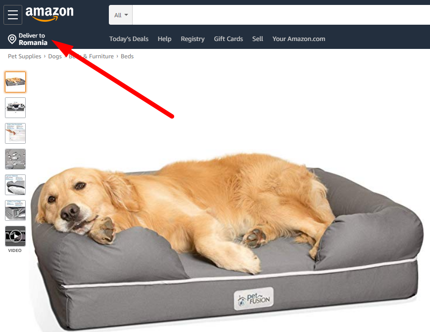
Right from the start, Amazon identifies where their visitors are and clearly states if they deliver or not to that country.
As I am writing this from Romania, Amazon assures me that this dog bed ships to my country.
It can also be seen on the right part of the product page, where they reinforce it.
Ratings and questions
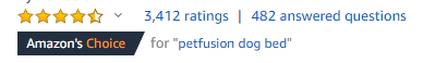
When users get to your product page they will have a lot of fears and uncertainties. It’s called friction and it’s natural.
You can never get rid of friction, but you can add trust elements that will reduce it.
Amazon displays the average stars rating and the total number of reviews right below the product title. Users can immediately notice the ratings and thus leave behind a few of their concerns.
This happens because they are assured that at least 3.4k other people have bought the product.
All ratings at a glance
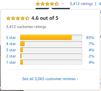
If you got 4.6 out 5 stars rating from more than 3000 people, be sure to show it off.
On the desktop version of Amazon, users can see a breakdown of all the reviews posted for a specific product just by hovering over the stars.
Even if this functionality is available only for desktop users, it can still have a great impact over the conversion rate. Users don’t have to scroll all the way to the bottom to see the reviews breakdown which in term may generate more impulse buys.
Urgency done right
Everyone loves discounts. Whenever you run a promotion you should make sure that your users know about it.
Amazon does a great job at creating urgency with a countdown timer.
People need a deadline to make the purchase, or they will just keep postponing it. Implementing a countdown timer will give your prospects a reason to purchase right now and not wait a minute longer.
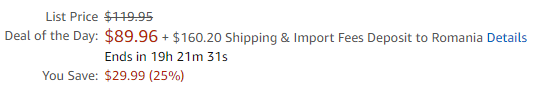
Clearly display all the costs upfront right on the product page
Too many ecom stores hide various fees until the last step of the checkout.
In this example, if Amazon did not specify the Shipping & Import Fees to my country, I would believe that I had to pay just $89.96. However, Amazon clearly states that the Shipping and Import Fees to Romania are $160.20.
I know from the start how much I am going to pay for this product including all fees.
Be clear about your fees and you will reduce your checkout abandonment.
You might think that this will affect your conversion rate as not a lot of people will be willing to pay the fees. However, if they see the fees during checkout, their surprise will be even greater.
You should also be very careful if you do not specify your import fees at all.
If a client of yours has to pay extra to receive their product (example: shipped from USA to EU) they will definitely leave a bad review for your business.
Be as clear as possible with your fees and you will have happy customers.
Show similar items
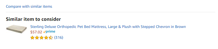
All people are at least a bit reticent before they finish a purchase. There can be a million reasons behind this. For example, the product that they are looking at might not meet their expectations.
In order to overcome this, Amazon displays a “Similar items to consider” section, which contains a single product related with the one the user is looking at.
Maybe the recommended product has more reviews, or maybe it is cheaper, or maybe you have a promo available for it.
This section is great to show users different related products that might make their decision to buy something from your website a little easier.
Frequently bought together
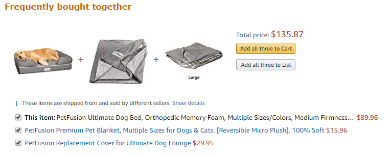
This section is self explanatory ang a great way to boost your average order value.
In this example, Amazon recommends two complementary products. If you are on the lookout for a pet bed, you would like to keep your furry friend warm and cozy, so you are very likely to add a pet blanket to your order as well.
Moreover, since dogs really like to chew everything, you would also buy a replacement cover.
Having these 2 products at a click away is a sure way for Amazon to squeeze more money out of you.
Beware, if you are going to add something like this to your website, make sure that the products are going to be complementary.
More recommended products
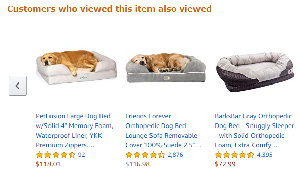
If anyone scrolls down enough to see this section, there is a high probability that they are not convinced enough to buy this dog bed.
This is a great place to display other products that people have also viewed. It’s certain that the user wants to buy a dog bed, but maybe the one they are looking at is not suited for their needs.
Showing them other options is a great way to not lose them. In the end, they might go with another one, thus making you a sale.
Video testimonials on product page
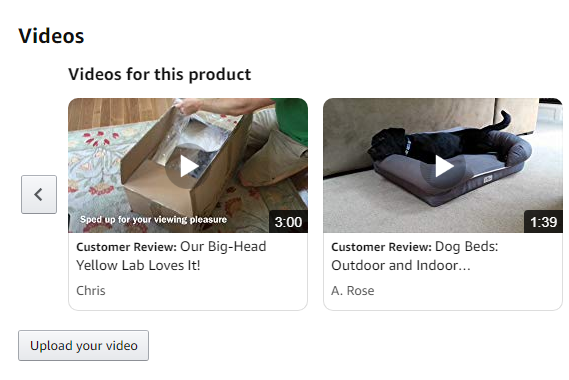
People need to see reviews before they finish a purchase.
Text reviews are the most common. Image reviews are way better. But by far, the best type of reviews are video testimonials.
Not only do people get to see exactly how the product looks from different angles, but they get to see how it works.
If you want to increase your conversion rate, adding video testimonials is perhaps one of the best ways. Just make sure that you actively request for video reviews from your existing customers.
Product comparison
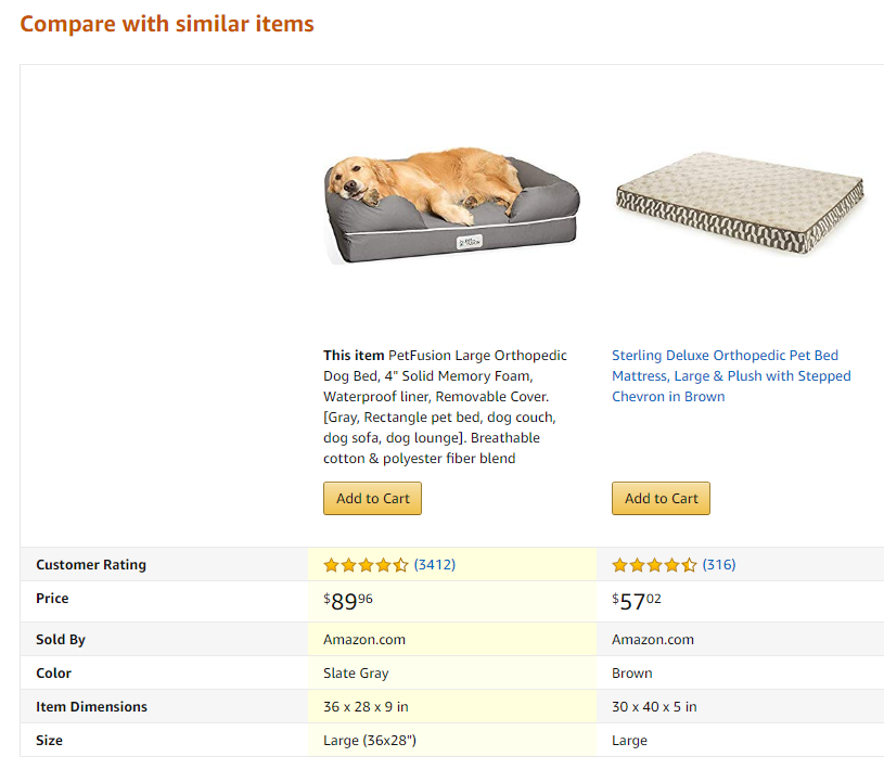
Inevitably people will want to go on Google and look for alternatives. Maybe they can find a better price, or a better quality product.
Whatever the reason, they will always do a lot of research before committing to a product. To overcome this behaviour, you can add a product comparison straight to your product page.
Doing this will keep people on your website while also allowing them to compare between your products.
Questions and answers
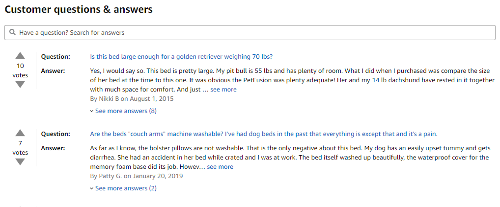
Yet another great feature that just a few websites currently have: Customer questions & answers.
You can try to answer all your customers questions with the product description, product image or video or even through reviews. Even if you do all this, some questions will surely remain unanswered.
This dedicated section will help your current and future customers make a decision faster, because they will be able to get answers instantly as they were already answered. Even if your users have a completely different question in mind, they will be able to quickly address it.
You can also add an email field so that your customers will get notified when their question has been answered, thus increasing your mailing list as well as your customer base.
Next you can have a look at how to present products on category pages or start testing right now with 10 Ecommerce A/B Testing Ideas for the Product Page (With Examples)