How to do Heuristic Research
When we’re referring to heuristic research, we’re referring to a method of analysis of any website that is based on evaluating the interface, compared to a set of UX and usability principles.
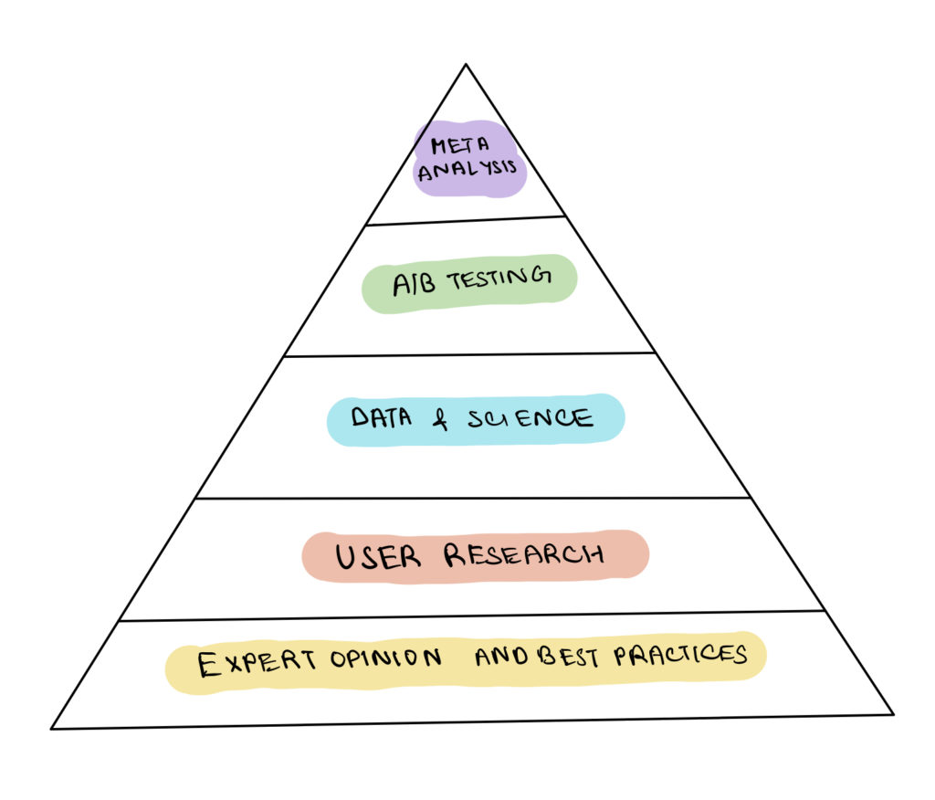
Heuristic analysis is part of the qualitative research of the CRO process. Much of the topics covered in heuristic research in CRO are related to usability, design, and psychology. Therefore, it lies at the bottom of the hierarchy of evidence pyramid. The quality of evidence for heuristic research analysis is low as it is based on expert opinion and best practices.
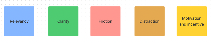
Let’s take a look at the 5 pillars of doing Heuristic research:
Relevancy
Relevancy denotes if the page meets the visitor’s expectations.That’s why issues on relevancy can lead to confusion and uncertainty among the visitors leading to drop-off and a fall in conversion rate.
Some of the factors to look for under relevancy are:
- Does the headline match the page content?
- Do call to action buttons match the value they’re going to get?
- Are the images on the page relevant to the content?
- If the user came from an external site (Google search, PPC, referral etc), will they recognise that it’s a continuation of their journey?
- Is each step of the funnel relevant in the user journey?
- Are there any elements in the page that deviate from the main topic/goal of the page?
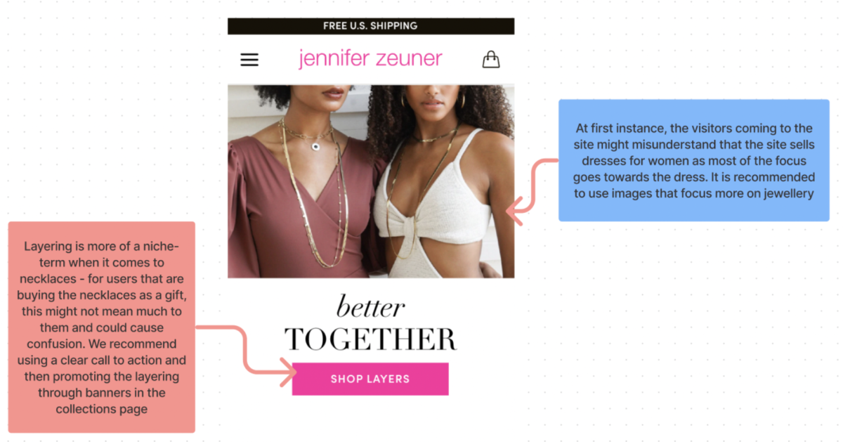
Let’s look at an example:
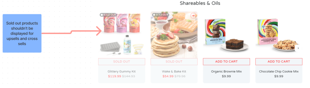
Here we can see that sold-out products are being promoted as upsells which are not relevant for this section. As a consequence, this might lead to visitors dropping off in the process.
Clarity
Denotes if the offer/content on the page is clear and easy for users to understand.
Issues on clarity lead to confusion and distrust among the users.
Here are some of the factors you can look for under clarity:
- Will my visitors understand what is the page about?
- Is my value proposition clear and without jargons?
- Can I understand what the product / service is, and how it works (in a reasonable amount of time)?
- Are there supporting images and/or videos that help me understand it?
- Is there a clear, visually dominant page goal that leads further into the funnel?
- Are the CTA’s clear on what will happen when I click on it?
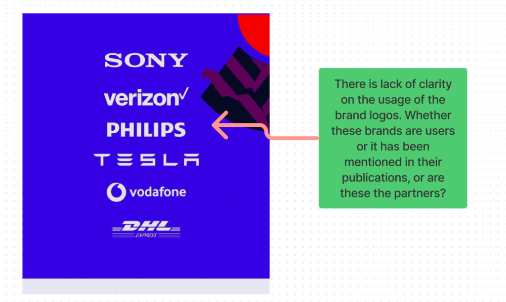
We can see here the logos of brands are used as social proof. However, there is a lack of clarity on the usage of brand logos. This can be assumed as customers of these brands or it can be their partners or they have been mentioned in their publications. Mentioning it will bring clarity and remove confusion.
Friction
Friction is something that is causing doubt or hesitations to take an action. Uncertainty is one of the biggest killer of sales.
Some of the major sources of friction are:
- Slow page loading speed
- Form fields are too long and contains unnecessary fields.
- Bugs and errors on site hampering the user experience
- Complex design of the site and hard to navigate
- Technical errors and cross browser/cross device issues
- Page content unable to solve the doubts or uncertainty
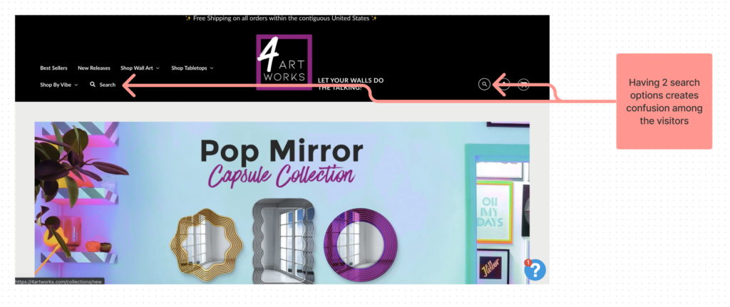
Here we have 2 search options in the navigation bar which creates confusion among the users and increases friction.
Distraction
This is what distracts/deviates the users from the most desired action. Distraction is a conversion-killing factor and should be removed immediately.
Some of the sources of distraction are:
- Is there any animated or blinking element on the page that distracts users?
- Is there any element that is grabbing attention away from the main action?
- Are there any visual elements thats making it difficult for the users to read the text?
- Is there any copy that is not about the specific action we want people to take?
- Are there social icons or links that takes users to a different page away from the main action?
Let’s see an example of Distraction:
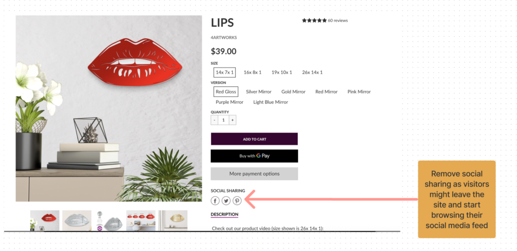
Here we can see that the social icons are a distraction for the users. It invites the users to click on them. Above all, taking them to another page away from the main action i.e. buying the product.
Motivation
Motivation is the catalyst that initiates the users to take the desired action. The factors affecting motivation are:
- Reciprocity – When someone gives you something. For instance, you feel compelled to give them something, this is known as reciprocity. Example: Giving people free access to our tool, guide, free download, they are more likely to buy from you.
- Commitment and consistency – People are more likely to comply with a small action first then proceed to a bigger action.
- Social Proof – Social proof is one of the most important element that helps in building trust and induce liking. Social proof can take the form of ratings, testimonials, logos, numbers etc.
- Authority – Authority is someone who is known by a large mass of people and whom people follow. An authority figure can be an athlete for a sport brand, a doctor for pharma brands etc.
- Liking – We are more likely to believe, trust and buy from people whom we like. For example – A person who owns dogs is certainly going to buy a food recommended by another dog lover than a cat lover.
- Scarcity – Scarcity is an element that increases FOMO among the users and build hype as people are motivated. More likely by the thought that they might lose the opportunity to gain something exclusive. Scarcity can be introduced in the form of time (12 hours left) or through Quantity ( Only 10 left).
We hope this makes sense to you and you will start applying it in your optimization and marketing efforts from now on. However, if you don’t feel like being bothered with it, we can also handle it for you 🙂
Just send us an email at [email protected] or fill out the contact form on our website and we would be more than happy to help!