How to design a good landing page: 5 proven tips to get more conversions, with examples
The process of designing a good landing page always starts with researching your target audience. You should have a few buyer personas in mind and start writing your copy and choosing your images in accordance with your future prospects.
It will be way easier to build something from scratch if you know your target audience beforehand.
Presumably you already did that, so here are 5 proven tips on how to design a good landing page that will get a lot of conversions.
A good landing page starts with a killer value proposition
You can consider your value prop as being the headline, call to action and the reason for why your prospects should buy from you and not your competitors.
The bolder the claim, the better, as long as it is not too exaggerated.
Take Sumo for example:
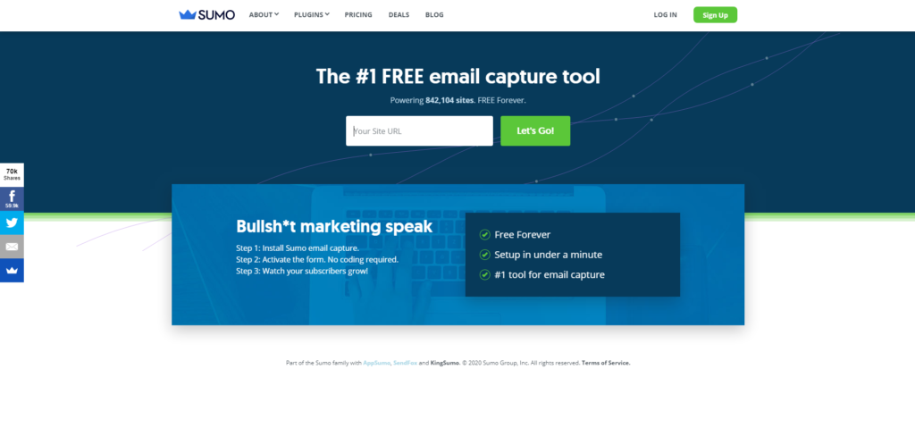
Their headline is very bold: “The #1 FREE email capture tool”. Notice how they emphasize the fact that the tool is free 3 times.
The subheadline shows the number of users that they have, 800k+. This increases trust and reduces the friction associated with testing a new tool. But since it is free you have nothing to worry about, just uninstall it and that’s it.
Another great example is Mailchimp:
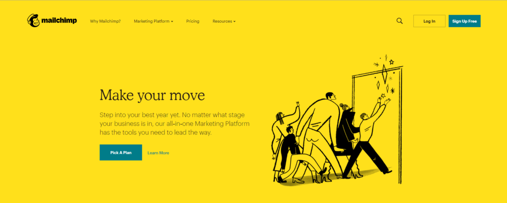
The headline of their homepage is not self explanatory: “Make your move”. But right below that they explain what their tool does and how it can help you make more money.
A value proposition doesn’t have to be just a headline. As long as people can understand what you have to offer in under 5 seconds, your value proposition will make wonders.
We have already detailed how to create a value proposition that boosts conversions.
Use images or videos that correlate with your target audience
A picture is worth a thousand words. A video is made out of thousands of pictures so I guess that makes it worth millions of words.
There is no better way to communicate your value other than by presenting it in a visual way.
Shopify is doing a great job at this:
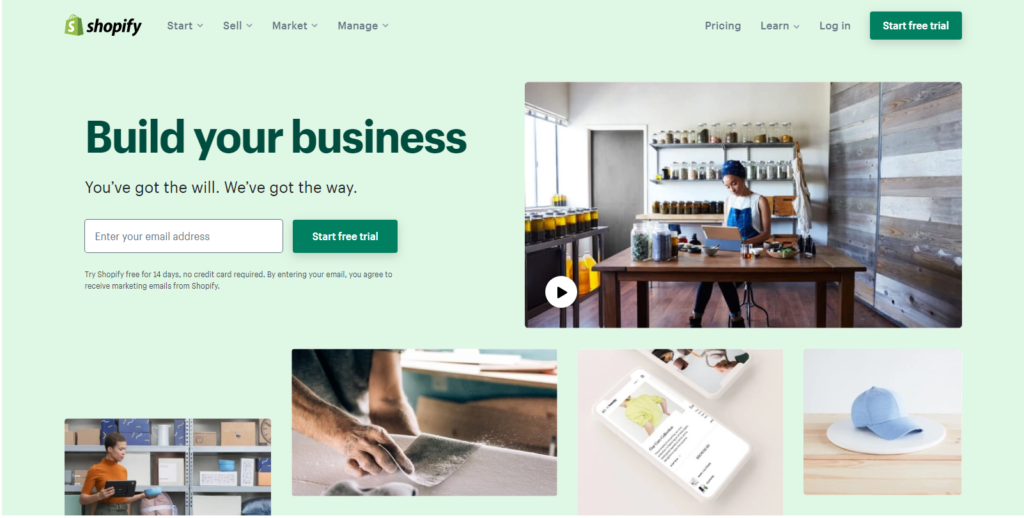
The video on their homepage presents small business owners and their journey in getting their businesses online.
That’s exactly the target audience of Shopify.
On the same note and with the same target audience in mind, 99designs has created a similar video.
This is a design crowdsourcing platform. You start a contest and designers submit designs. You pick a winner out of all the entrees.
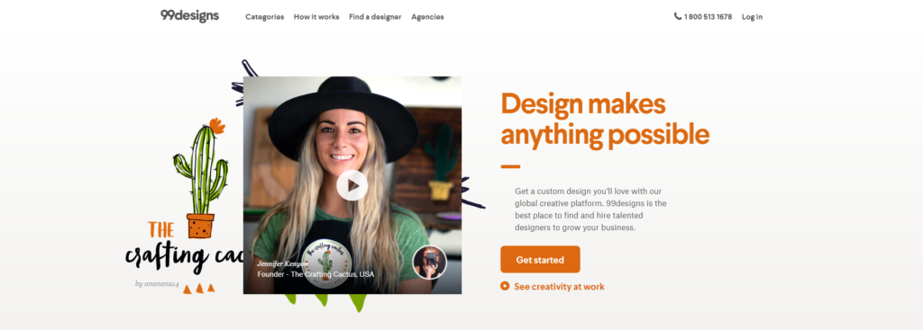
Since they focus on small business owners or just individuals, their video depicts perfectly who might use their services.
The last example that I want to share with you, is the hero image of Home Instead.
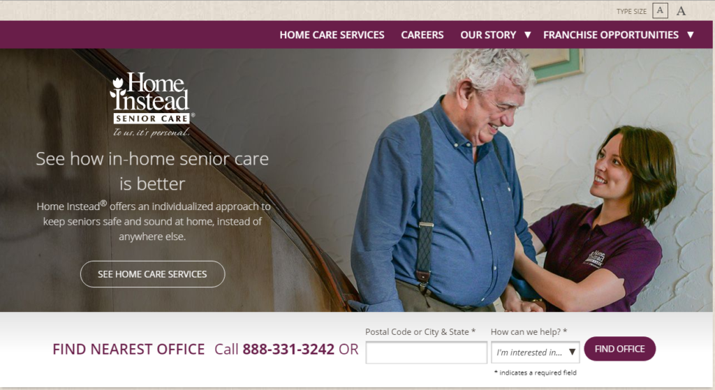
Since their target audience is both elderly people and their kids or grandkids, they found a common point that appeals to all of them: the well being of their tenants.
The image that they have chosen depicts a happy elderly man that is being assisted by a professionally trained caretaker.
You can almost feel the message and rest assured that if you do choose their services, your elderly relatives will be in a good and safe place.
A good landing page is simple and concise
You want to get your message across to as many possible prospects as you can. That’s why having a clear and concise copy on your landing page is mandatory.
Do a quick test on your current landing page and read it out loud. Does it sound robotic? Is this how you would explain your services or products to your friends in a bar?
If your answer is no to either of these 2 questions then you have to make it simpler.
For example, Cloudflare is a renowned content delivery network. Their copy is targeted towards tech savvy people that already know what a CDN is. Although their platform is really easy to use and doesn’t require you to know programming at all. Here is how they present it:
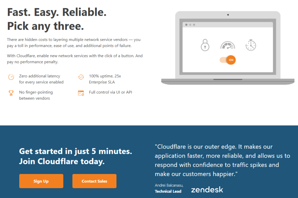
If I had never heard of a CDN before, I definitely wouldn’t understand how will this help me, my business or my website.

On the other side, BunnyCDN is a smaller content delivery network. But they did a great job at explaining what they do. Even people that have never heard of a CDN before will understand that having one will increase their website loading speed:
A clear CTA differentiates a bad landing page from a good one
Whatever the goal of your landing page is (get leads, subscriptions, sales or anything else) you should make it as clear as possible.
Hotjar does a great job at this:
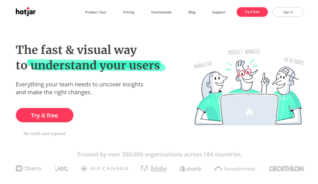
Their CTA button states “Try it free”. In addition, the microcopy right below the button reassures users that they don’t need to add their credit card information.
When people are scouting the market for a user tracking solution, they most definitely find Hotjar. But people don’t just go all in instantly for a product without doing a lot of research.
Hotjar reassures their users that they can try the tool for free.
Crazyegg’s homepage has 3 call to actions:
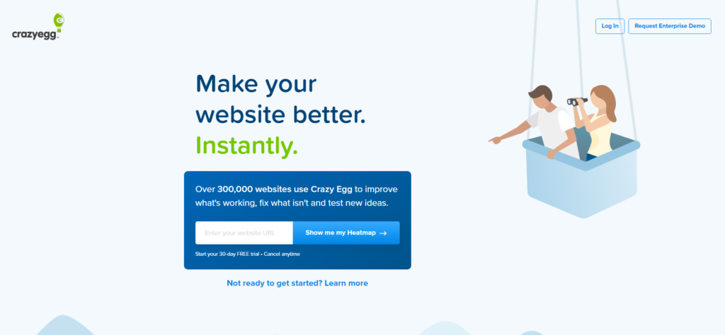
It’s really interesting to notice how the 2 persons in the balloon are pointing right at the CTA box.
They made it even clearer where your attention should be directed.
The CTA states “Show me my Heatmap” which is exactly what you want to accomplish if you buy their product.
The other 2 CTAs in the header are also crystal clear: if you have an account you can login or if you have an enterprise level business you can request a custom demo.
Make your LP great by adopting a mobile first approach
That means that you should first mockup a wireframe of your landing page for mobile devices. Only after you’ve done that go ahead and create the desktop version.
As a lot more people are browsing the internet using their phones, your first priority is to adopt a mobile first approach.
A lot of your users will browse your website both from their mobile devices and from their larger screen laptops or computers. You have to be sure that the overall experience is consistent, otherwise you might scare them away.
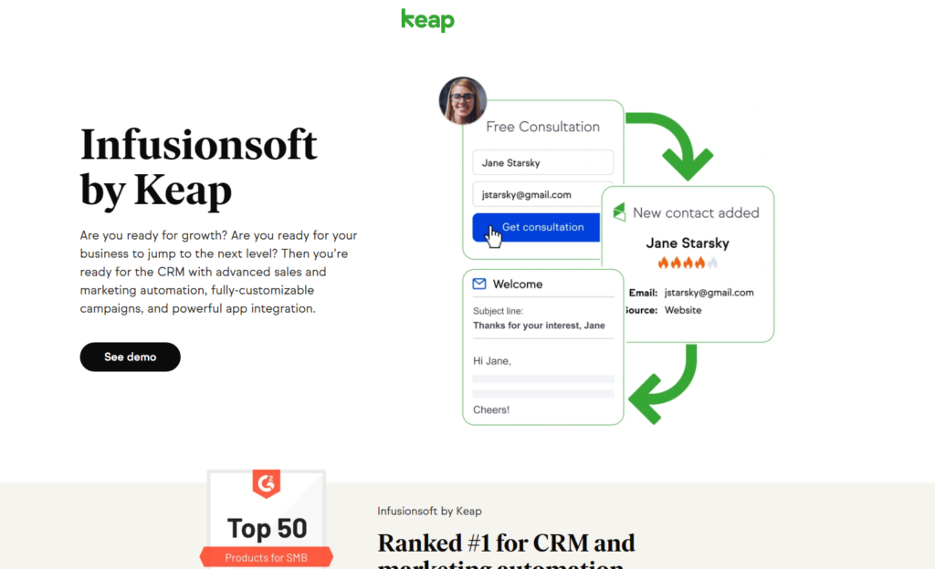
Let’s take Infusionsoft by Keap as an example. They offer a fully integrated CRM for their clients. This how their landing page looks like on desktop:
And this is how it looks like on mobile devices:
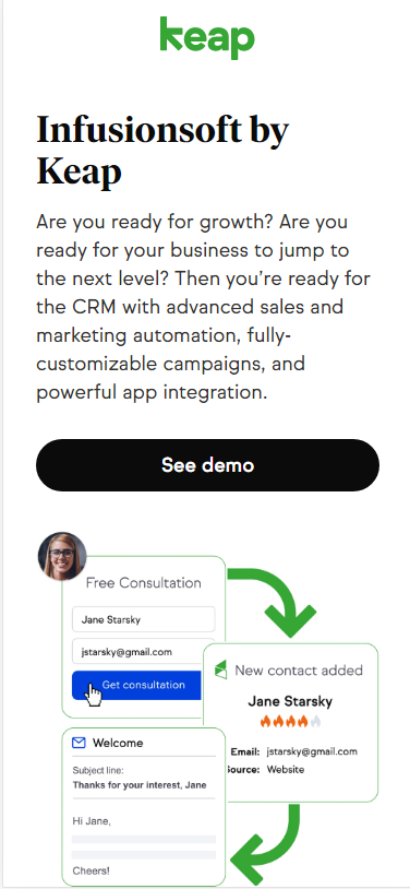
Notice how they kept all the elements of the desktop version on the mobile version.
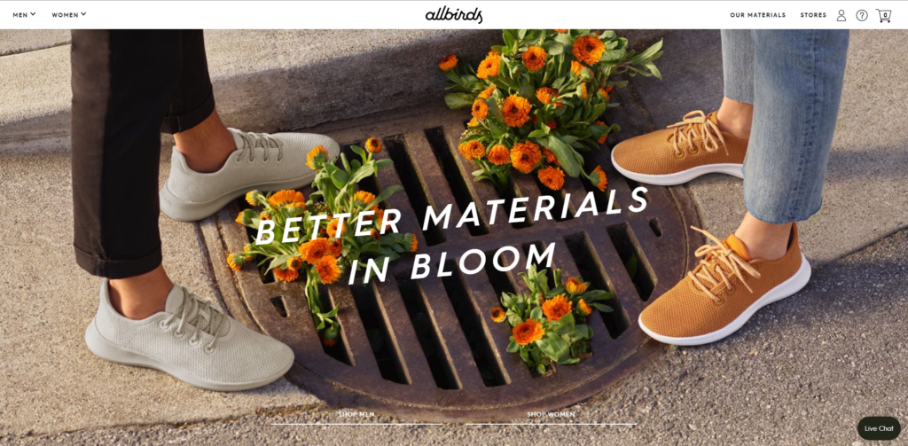
Another good example is Allbirds. An ecommerce brand that sells shoes. Here is how their landing page looks like on desktop:
And here it is how it looks like on mobile:
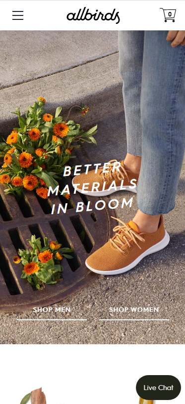
Even though the image is cropped, they have kept the most important part of it in the viewport: the shoes.
Key takeaways:
- Make sure your landing page is consistent across devices;
- Design your landing page with your target audience in mind;
- Make it as simple and clear as possible so your users will know what they have to do to achieve your outcome.