
Web form optimization is a must for increasing your conversions and leads
Wondering why few people are subscribing to your newsletter or your brand new lead generation form? One aspect that is often overlooked when enhancing websites is form optimization. Creating a user-friendly, short and clear sign-up form can lead to great growth.
Forms are the perfect place to create a link, a conversation, between people and businesses. However, users might often become uneasy when being asked about personal information. This is where form optimization comes into play. So how do we make our website visitors comfortable with offering this kind of information?
Transparency
First of all, users need to know why you are asking for information, what you plan to do with it. Always make sure the whole process is stated clearly at the beginning of the form. For instance, names and addresses are needed for deliveries, credit card details for completing payments, and so on. If your form has multiple steps that are not visible right from the start, make sure to mention any aspect that might negatively influence people (such as having to pay for a service or signup).
Another method that might influence users to complete your form is to tell them right from the start how long it will take to finish the process, and what benefits they receive by making the effort.
Form Fields
Successful web forms have as few fields as possible. Always remember that every additional field increases the chance that users will abandon the process. Make sure your form only asks for necessary information (name, address, payment information, etc.) Titles and birth dates are most often not needed.
For instance, if you are selling a PDF document, you only need to ask for payment information and for the email address so you can send it to the users. On the other hand, if you are selling products, buyers also need to provide their shipping address.
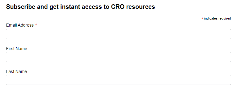
Another step in web form optimization is stating clearly what fields are required and which ones are optional. Only adding an asterisk to the necessary information might not be enough, you should also consider adding the text “optional” next to the fields that aren’t required.
On the other hand, asking for too little information may actually decrease conversions, as it can come across as spammy. For instance, if we’re talking about a signup for a job newsletter, users will be more inclined to subscribe if they can customize the offers they receive, according to the job field, level of experience, locations, and so on. If they only enter their email address, they will be receiving all sorts of irrelevant job offers. Always make sure to make the right decision for your field of work.
So what is the best number when it comes to form fields? According to a study from Eloqua, you should generally focus on having anywhere between 5 and 10 fields, with 7 being the sweet spot.
Multiple Steps
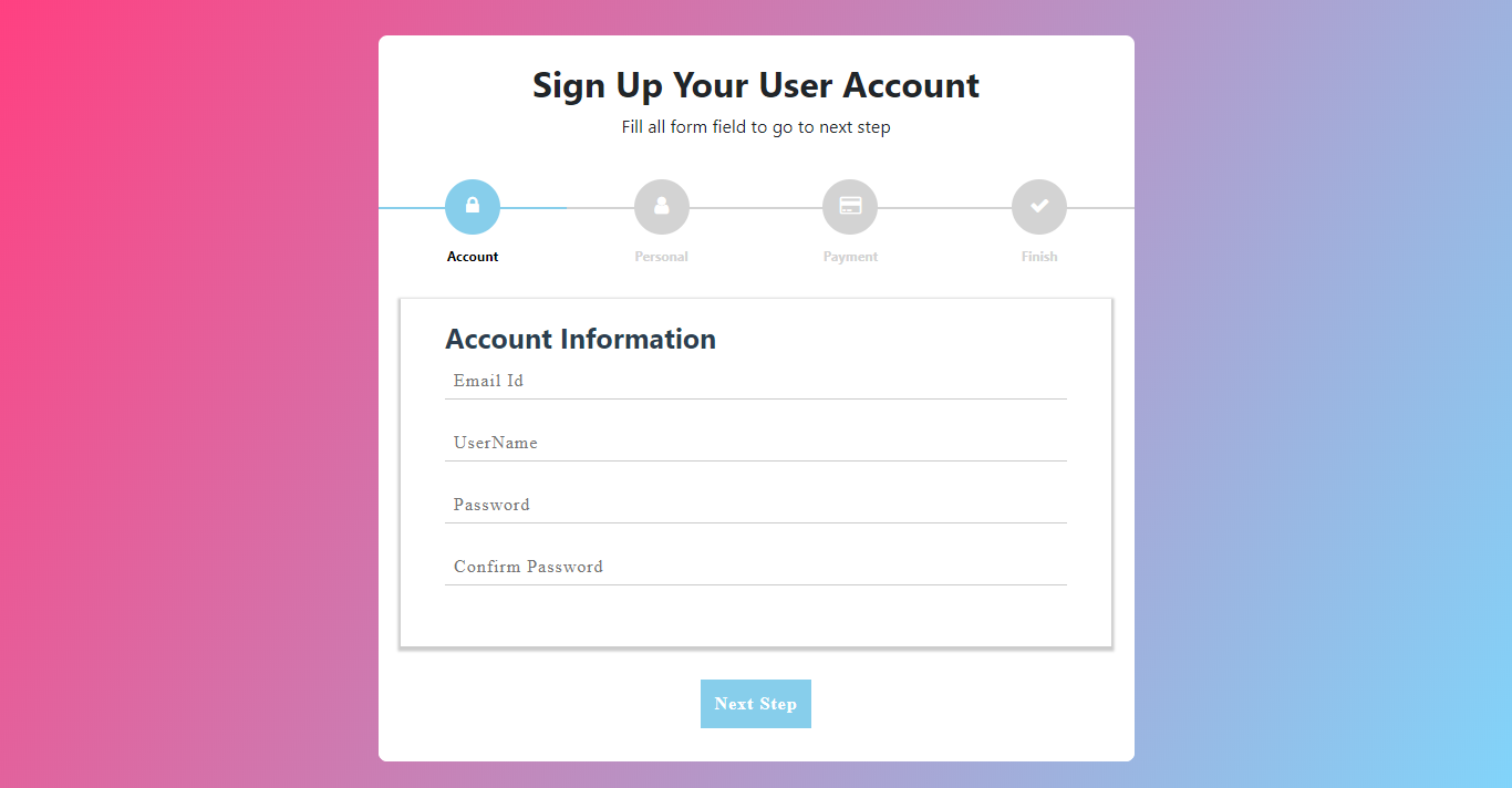
If you do have more than 10 fields in your form, you should consider creating multiple steps. A very long form can be intimidating to users, so splitting it into several steps is sure to reduce friction.
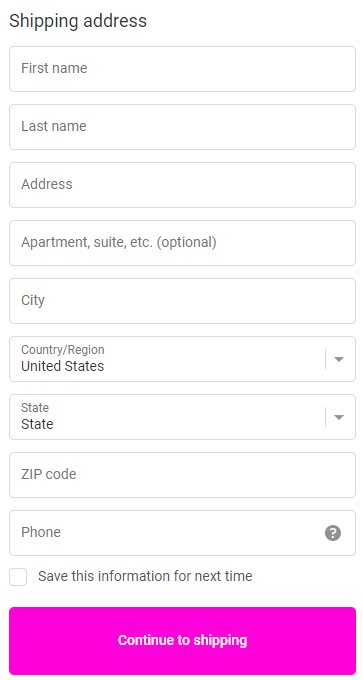
When including multiple steps, the most important information (name, email address) should always be included in the first step. Furthermore, users should be able to view a progress bar, so that they know where they are in completing the whole process.
The alternative to using multi-step forms is to structure your single-page forms into multiple sections.
Design

Now that we’ve covered the structure and purpose of web forms, it’s time to move on to the next step in web form optimization: design.
First of all, always start with the easier information (name, email address). People are more inclined to continue the process with more sensitive information, since they’ve already started to fill in the form.
What about labels? These should always be placed above the form fields, so that users can see them both in just one glance. However, if your form is very long, you might consider aligning the labels to the left side of the form. Drop-down labels should always be used for important information when users have to choose between more than 5 options. As for radio buttons, these work well when there are less than 5 choices.
What happens when we have a whole lot more choices, for instance when choosing a country? In this case, we recommend implementing a system where website visitors can type and search easily, instead of having to scroll an endless list to find their option.
When considering which type of text to use, we recommend going for regular. Bold fonts are more difficult to read and may seem intimidating to users.
Last comes the password field. Even though two password fields for confirmation have been used for years, today this is unnecessary. In order to reduce friction, it is best to add the “show password” option next to the field. This helps users check if there are any typos without having to type the password again.
Feedback
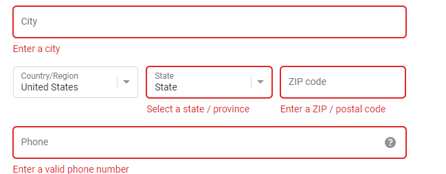
Sometimes, users can fill in the wrong information and thus receive an error message when trying to submit the form. Since seeing such messages can discourage people from completing the process, so you should do your best to avoid errors. We recommend recording events with the same error message names in Google Analytics via event tracking. In this way, you can easily detect whether users have problems filling in certain fields and fix these issues.
Mandatory fields should always be stated as such, and labels should always be specific as to the type of information that is required.
A good solution to reassure users that they’ve entered the correct information is real-time in-line validation. This feature automatically detects correct answers, and can also suggest valid answers. Usually, a green checkmark or a red cross is shown next to the field, to let users know if there’s anything they should change about the data they just entered.
Captchas
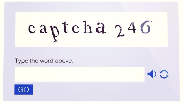
While captchas certainly do protect against bots, some people might be discouraged by them as well. According to a study from Stanford University, it takes 9.8 seconds to complete a visual captcha, and 28.4 seconds to hear and solve audio captchas.
Try to avoid implementing this feature in your web forms, or at least make sure it shows up only if there are suspicions of abuse over the forms. Such signs include submissions with spam words, blacklisted IPs or multiple submissions over the course of a short period of time from the same IP.
Addressing fears

When asking for sensitive information, you should always do your best to reassure users that nothing bad will come from completing your web forms. You can overcome these fears by showcasing various trust marks, such as: Free (there are no fees), Safe, Secure, Protected, Anti-virus seal, Identity seal, BBB (clean record).
Keep in mind that exaggerating with these seals can also lead to friction. Make sure you find a good balance when adding them to your website.
Lastly, always make sure you keep an eye on form analytics. Web form optimization is an ongoing process that should take into account session replay videos and user testing.